Money Goals
An app for non-financial experts to create, manage and achieve saving goals.

Providing users with a clear representation of their financial data so they can easily achieve their saving goals
CONTENT
1. The Challenge
2. User Stories & User Flow
3. Sketching
4. Wireframes
5. User Testing
6. User Interface Design & Mockups
7. Brand & Style Guidelines
8. Landing page
9. Reflections & Learnings
CareerFoundry concept project
UI Design
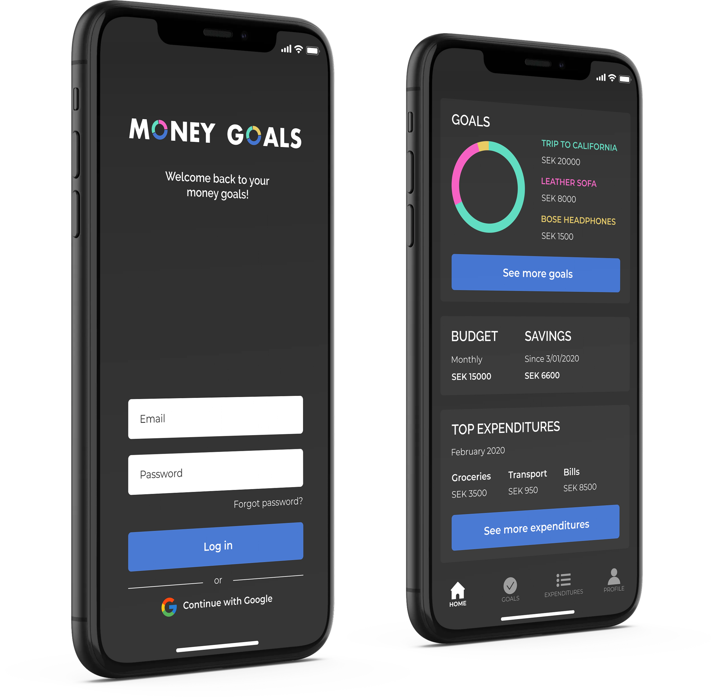
Light & Dark mode
User Testing
Web user interface design
Tools:
Figma
InVision
1. The Challenge
The challenge for this project was to design an intuitive interface for non-financial experts that would provide them with a clear representation of their financial data and help them create, manage and achieve their saving goals. Designing for both light and dark mode also meant ensuring a consistent look and feel in both versions.

2. User Stories & User Flow
I created a user flow based on 5 user stories that summarise the user's main tasks and goals.
User Stories
As a user, I need to be able to tell the app what my saving goals are and how long I have to reach them so that I can save accordingly.
As a user, I want to have a dashboard of my finances where I can see my budget, how much I'm spending and saving.
As a user, I want to visualise the progress of my saving goals.
As a user, I want to be able to change and/or remove existing saving goals.
As a user, I'm happy to receive a personalised savings plan so that I can optimise my savings and reach my goals in time.

3. Sketching
Once I had a clear view of the user flow, I moved on to sketching low-fidelity wireframes to visualise some of the user's main steps on the app.

4. Wireframes
In this phase of the project, I further developed my sketches and designed mid-fidelity wireframes, building out the user's flow and the app's layout.

5. User Testing
The Money Goals design you see today is the result of several iterations and continuous improvement. One of the steps along the way was conducting a scenario-based user test. The feedback received was really important to correct elements of the design that could potentially confuse the user. It was also helpful to improve the overall experience on specific screens such as the home page.
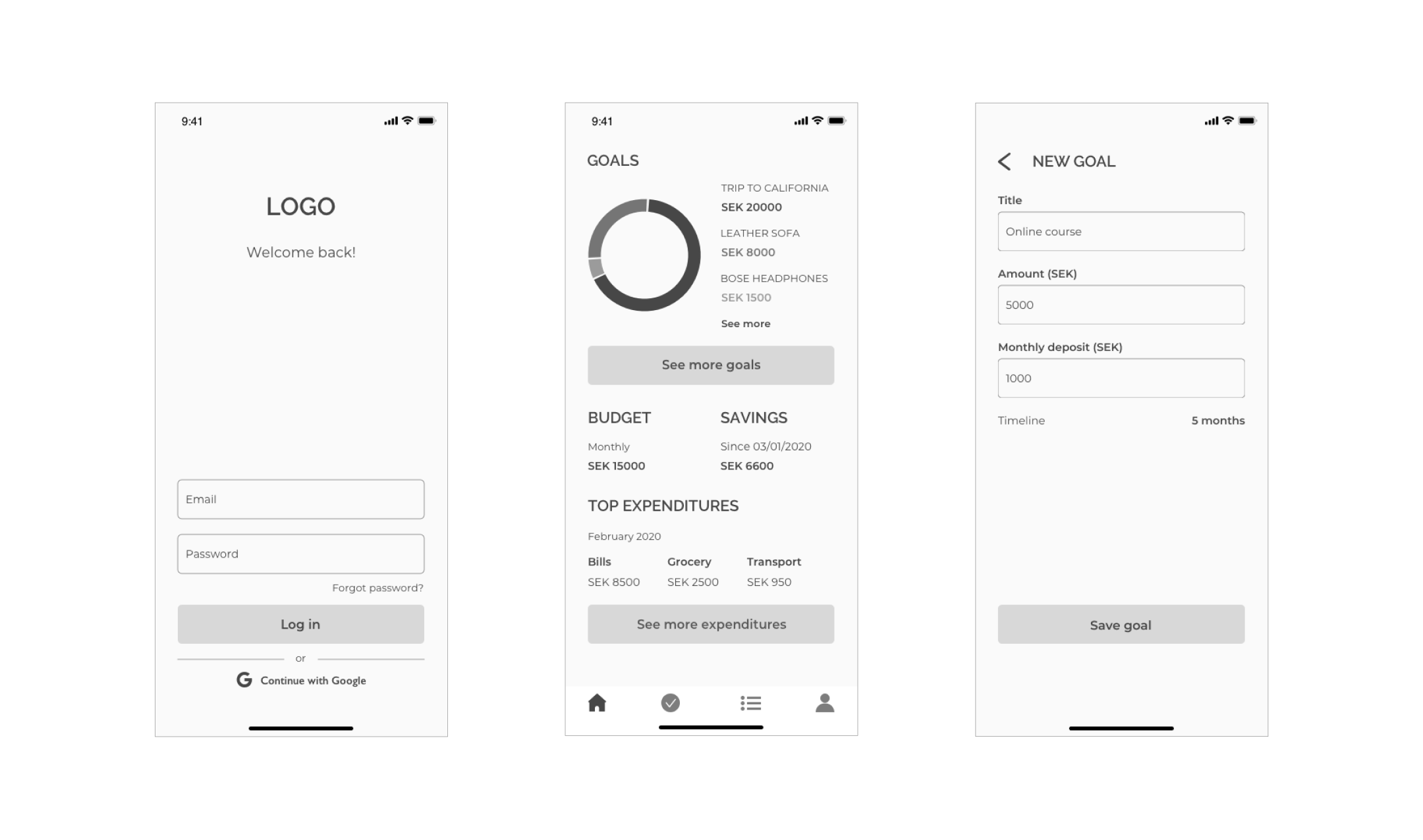
6. User Interface Design & Mockups
The user interface is composed of 12 screens in both light and dark mode. The mockups below give a comprehensive overview of the key screens and functionality.
A CLEAR OVERVIEW OF YOUR DATA
Once logged in, the home page provides users with a dashboard where they can visualise their latest goals, monthly budget and savings, as well as their top expenditures. From there, they can navigate the app to see more goals and expenditures and access their account page.
MANAGE YOUR GOALS IN PROGRESS
Users can visualise the details and progress of each goal and enjoy the flexibility of editing them as they prefer.


YOUR DATA AND GOALS STAY UP TO DATE
Whenever goals are added, edited or deleted, the dashboard will adjust accordingly, providing users with updated data at all times.
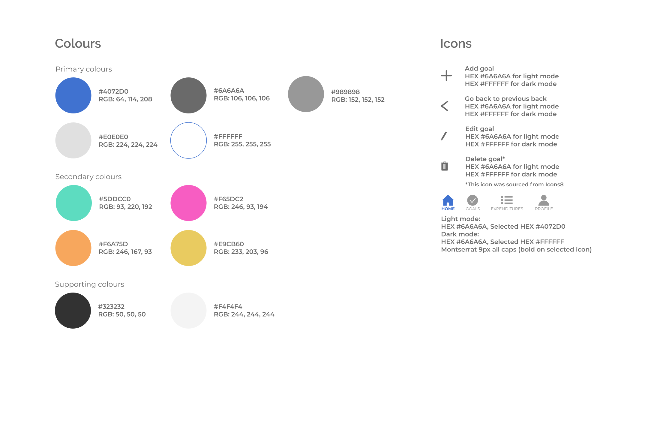
7. Brand & Style Guidelines
Money Goals' brand guidelines reflect its professional and trustworthy look and feel.


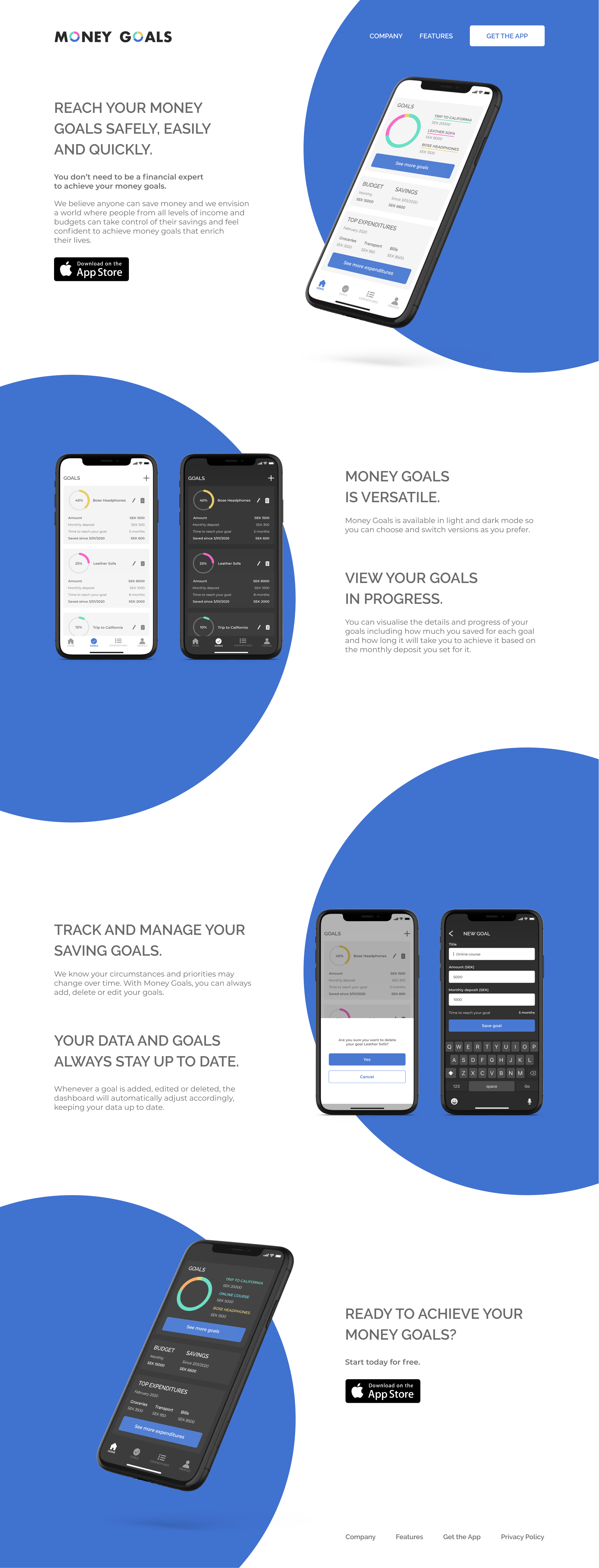
8. Landing Page
The goals of the landing page was to entice users to download the app, giving them an overview of Money Goals’ vision, benefits and intuitive functionality, especially designed for non-financial experts.
9. Reflections & Learnings
Working on Money Goals, I learned how to visually represent data on an app while keeping it easy for users to understand and manage. It also taught me how to design in light and dark mode while ensuring a consistent look and feel. Creating a user flow based on specific user stories was really helpful to stay focused on the key functionalities of the app and users’ feedback during testing was essential to the improvement of the user interface design.