Zalando
Product page re-design
How might we reduce the returns generated by the fashion industry?
Hyper Island concept project, March - April 2022
User Research
UX Design
Testing
Tools:
Google Forms
Figma
Miro
Lyssna (formaly UsabilityHub)
“Each year, an estimated 5 billion pounds of waste is generated through returns.”
“40% of consumers say they return clothing bought online because items don’t fit as they expected.”
The problem with returns
“At 88%, clothing was far and away the most common type of product people returned.”
“Across all Zalando’s markets, the average return rate is about 50%”
First hypothesis
We believe that a more informative and detailed product page will reduce the number of returns and increase the conversion rate as a result of customers’ satisfaction with the product they receive.
What is driving the high number of returns?
I’ve surveyed users to find out.
Key insights from responses:
Need for accurate product details and good images
Poor fit and wrong size are the top reasons for returning an item
Clear link between product information and the number of returns
OBSERVATIONS ON FIRST HYPOTHESIS
While the survey confirmed the common problems with returns and the need for a more informative product page, the impact of the product page on the conversion rate and the number of returns can't yet be confirmed.
Breaking down the problem and ideating possible solutions
Main problems highlighted: impact on the environment and category of items returned by online shoppers.
Solutions are focused on how to provide users with what they need to choose the right size and fit and become less likely to return.
What are the possible solutions?
IN DEPTH HYPOTHESES
1. We believe that providing size recommendations based on the customer’s profile measurements will enable them to purchase the right item.
2. We believe that a more visible display of reviews will give customers a good indication of possible issues (if any) or reassure them about their purchase.
3. We believe that a more detailed and visible display of the product and delivery/return information will give customers purchasing confidence.
4. We believe that showing how the item fits on people in real life will give customers a better idea of whether it’s the right purchase for them.
5. We believe that a clear display of sustainability information will increase customers’ consciousness around the impact of fashion on the environment.
6. We believe that a reward system for low-return customers will encourage them to avoid purchases that will most likely result in returns.
Re-designing the product page
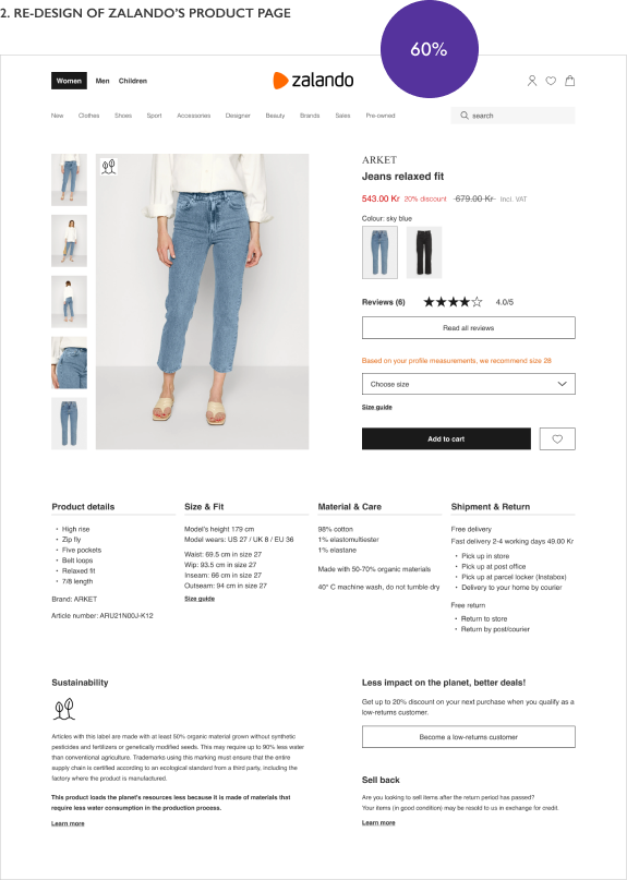
When following up with some of the survey participants for further questions, I've learned that most prefer shopping on a desktop rather than mobile. That gives them a better view of the product details and the ability to compare other websites by having multiple tabs open at the same time.
Users want full visibility of the product details
PREFERENCE TEST
At 60%, testers preferred the re-design.
While they are not visible here, I've taken into consideration some of the comments shared by testers who still preferred the current product's page, and I used them for further design improvements later on.


“The product details are all right there, without having to look elsewhere. They also show shipment and return, material care and sustainability information that you don't have to look for.”
“I like the reviews up and visible and the recommendation from my profile measurements. It’s nice to have information displayed directly under the pictures so you don’t have to click to see materials or fit.”
“The product's photos are bigger, easier to look at. All info is listed underneath the photos so I don't have to click multiple times to view it. The sustainability info would nudge me into buying.”
Details give users purchasing confidence
DESIGN SURVEY
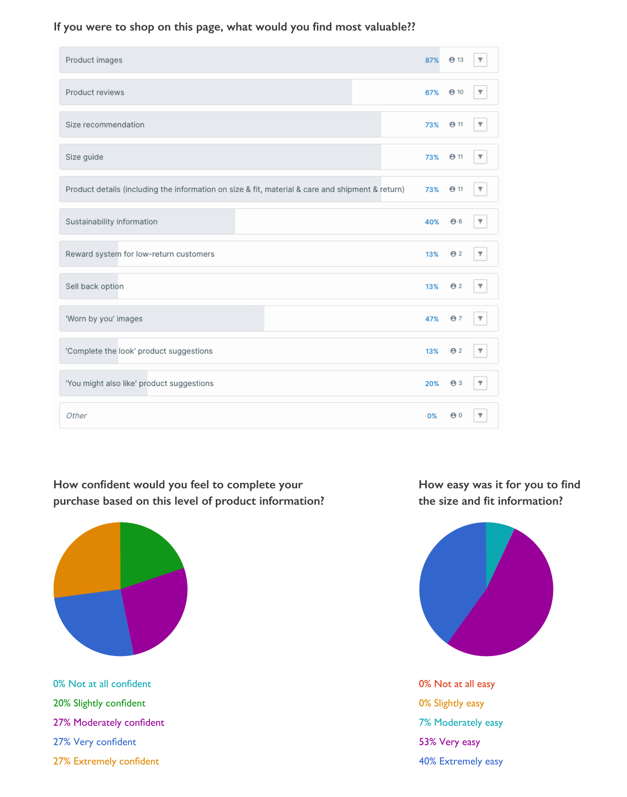
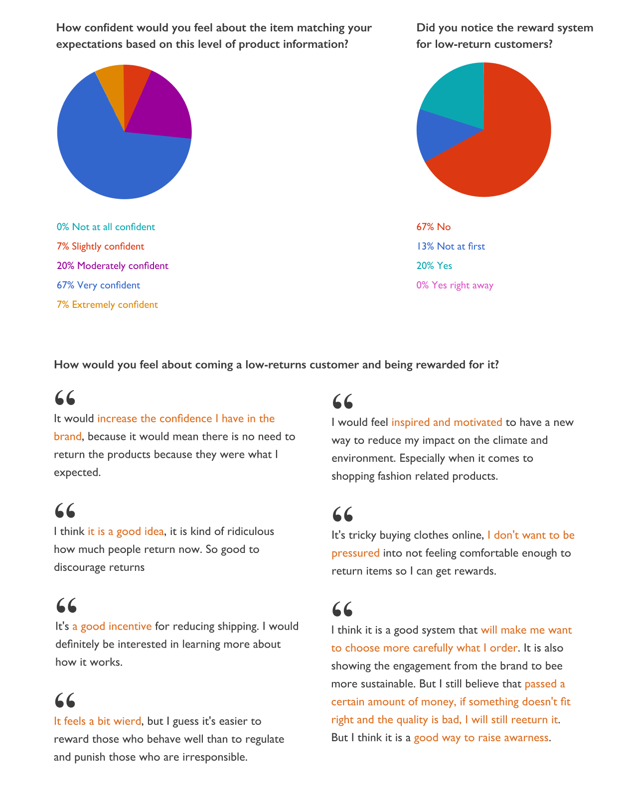
Participants were asked questions on their impressions of the re-design.
Summary of responses:
Customers value product images and details to make an informed decision and be less likely to return an item.
They would feel confident completing their purchase and very confident that it would match the item description.
They found that it was easy to locate the size and fit information.
Customers didn't notice the reward system for low-return customers, with some liking the idea and others stating they would feel pressured to keep an item.


OBSERVATIONS ON IN-DEPTH HYPOTHESES
The hypotheses about the product details were validated, confirming the need for a more informative product page. While there are some positive reactions from testers, a reward system for low returns can't be fully validated at this time.
Small improvements make a big difference
FINAL RE-DESIGN
After analysing the result of the tests, I’ve implemented further improvements to the re-design of Zalando’s product page:
Increased the font size of titles and price - noted by testers who preferred the current design
Highlighted the sustainability aspect of the product - some testers felt that the icon alone placed on the image was not immediately clear to them
Used green to highlight the title of the sustainability section and the reward system for low-return customers
Improved the selection of items in the ‘Complete the look’ and ‘You might also like’ by including sustainable products
Diversified the section ‘Worn by you’ by showcasing more than one body type
Mobile re-design
Learnings & next steps
This project shows that even small improvements can make a big difference. The next step would involve testing the updated design and allowing users to interact with the product page.
With new technologies that enable customers to try a garment in a VR environment, or use a personalised avatar to get a better sense of the garment’s fit, the possibilities are no longer limited to a more detailed product page.


