Small Crowd
A location-based app to find small events in your city.

Overview
Small Crowd is a UX and UI app and responsive design project.
Objective
The goal for this project was to design a location-based app by gaining a good understanding of users’ needs and goals and translating them into an engaging interface.
Idea
The idea of Small Crowd came from my experience as an expat living abroad for many years. I noticed how it's not always easy to find what's on in a big city, outside of the big events space. Often, you only know about small events such as a wine tasting or a stand-up comedy through word of mouth or a time-consuming search online.
Challenge
The main challenge was gaining a good understanding of users’ pain points and behaviours related to the search for smaller events in their city. Creating a more personalised experience for users, in comparison to the one offered by other event apps, was at the core of this project.
Approach
Conducting competitive analysis and user research in the early stage of the project helped me gain key insights to lay the foundation of my work. Afterwards, I created a style guide that included Small Crowd's branding and UI elements. In the last phase, performing an A/B test on the home screen, allowed me to refine the final design for mobile, tablet and web interfaces.
Learnings
This project thought me about the steps involved in the design of an app and how each exercise, test and iteration adds value to the process. I learned about the importance of understanding users (rather than designing based on assumptions) and testing multiple times.
PROCESS & TOOLS


STEP 1. COMPETITIVE ANALYSIS
UX Design
In this initial phase of the project, I conducted a competitive analysis on two existing events’ applications, Eventbrite and Fiver. The first step was about writing a competitor overview, which included an outline of their key objectives, their overall strategy and their market advantage. The second step was about understanding their marketing profile. Finally, based on all information gathered, I performed a SWAT analysis and UX analysis. I found this exercise to be really valuable to identify elements I could incorporate and combine into the design of Small Crowd as well as opportunities to realise a more curated experience.
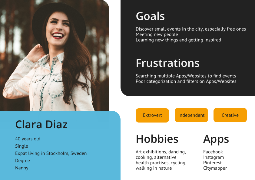
STEP 2. USER PERSONAS
UX Design
My user research involved conducting one-on-one interviews to understand users’ habits, needs and pain points around finding events in their city. I asked questions about their lifestyle, interests and their use of applications to search and book events. By documenting their answers, I could identify common goals and frustrations that I summarised in the user personas below.


STEP 3. USER FLOW
UX Design
After gaining key insights from the competitive analysis and user research, I created a user flow based on 4 specific user stories that summarise their main goals.
User Stories
As a user, I want to be able to quickly see events happening in my city.
As a user, I want to be able to select specific criteria including the location and the type of events I'm looking for.
As a user, I want to be able to set events’ preferences on my profile, based on my interests and needs.
As a user, I want to be notified of any changes and updates about events I liked and booked.

STEP 4. USABILITY TESTING
UX Design

For this step, I sketched low-fidelity wireframes and created a prototype using InVision. This exercise was important to gather initial insights into users’ behaviour and identify where in the flow they would get confused or look for functionalities that were not available. In the same way, it was great to confirm what parts of the experience were easy and useful for them.
STEP 5. MOOD BOARD
UI Design
Small Crowd's mood board reflects its urban character where strong and modern elements blend with a fun and friendly experience.

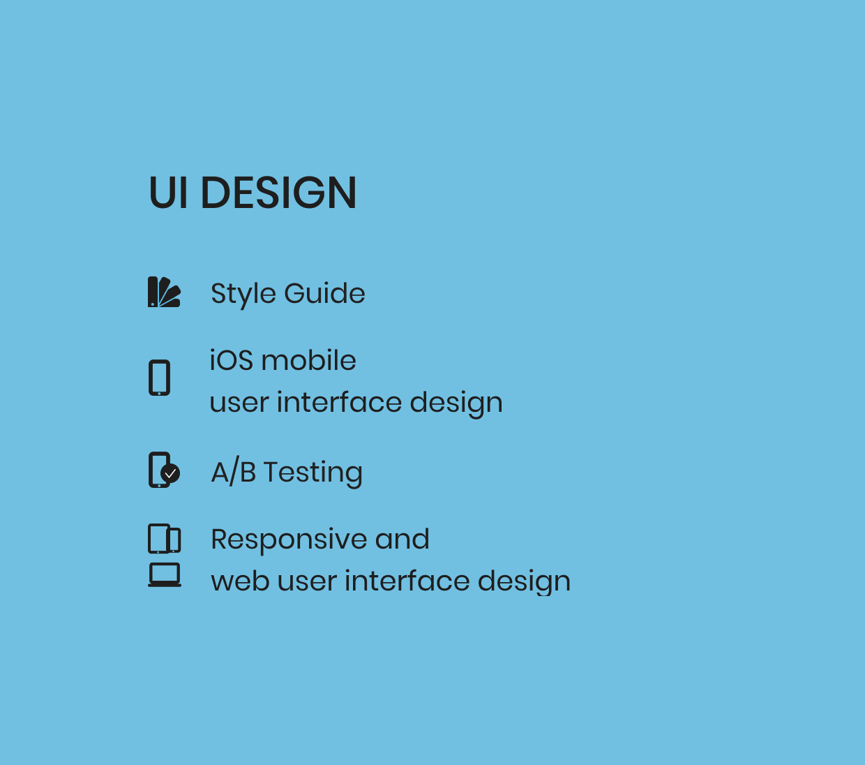
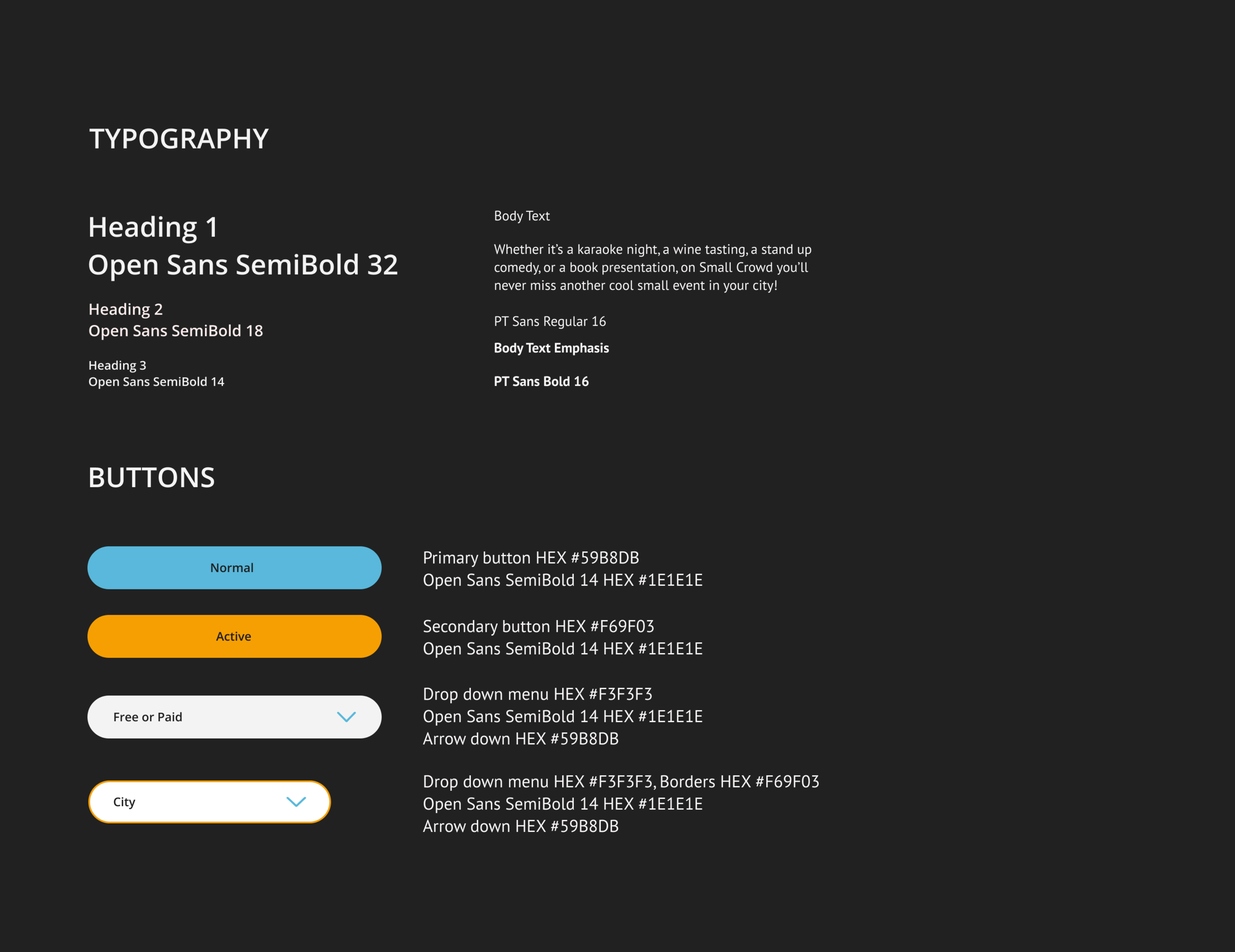
STEP 6. STYLE GUIDE
UI Design
In the style guide, I grouped all elements that together create the modern, strong and urban look and feel of Small Crowd.
They include:
- Logo
- Colours
- Typography
- Buttons
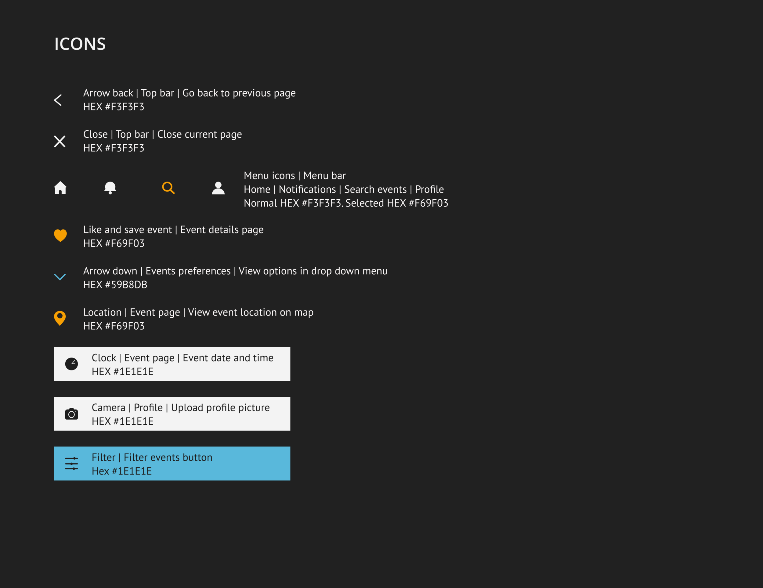
- Icons
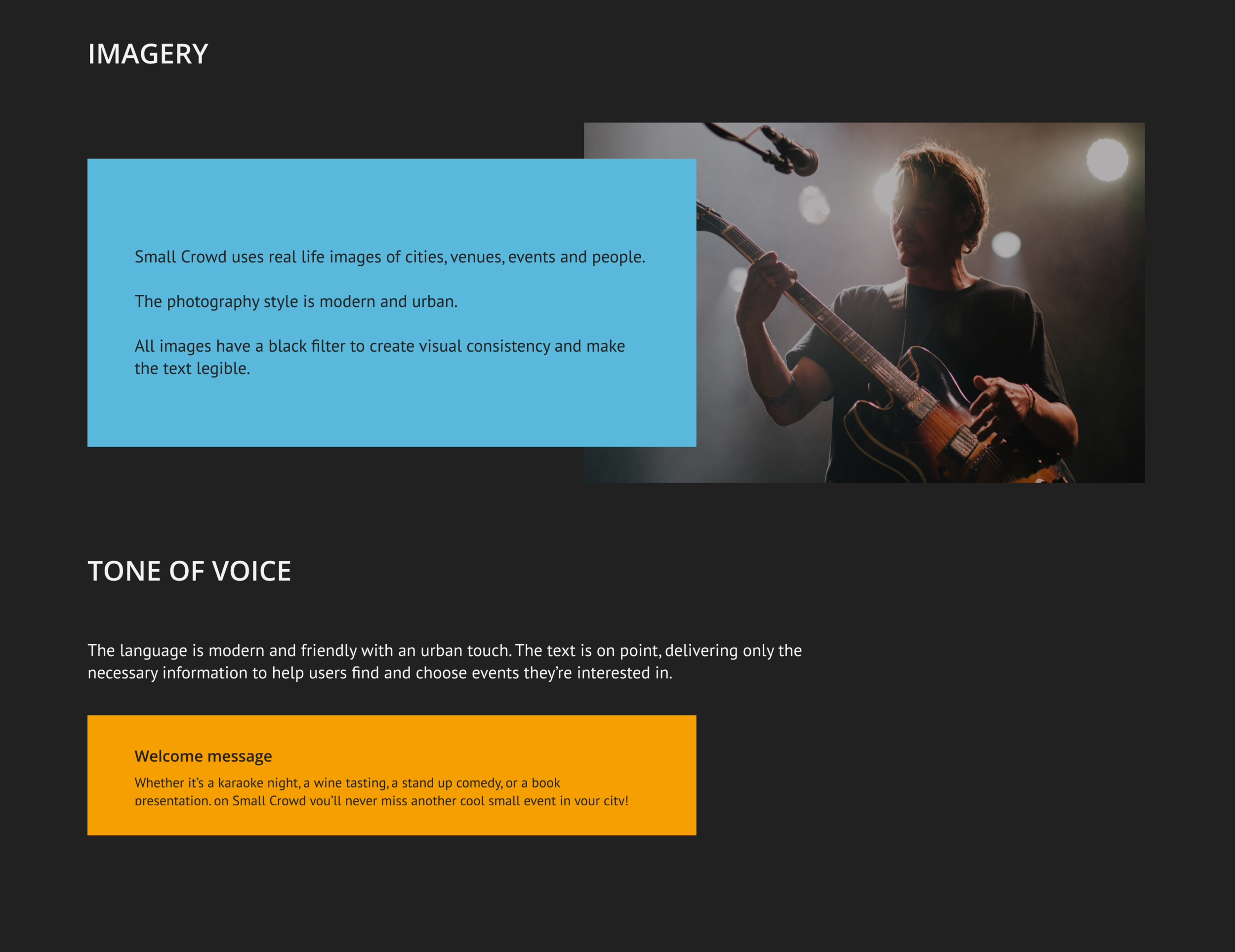
- Imagery
- Tone of voice

STEP 7. WIREFRAMES
UX Design
Before moving on to the UI design phase, I created mid-fidelity wireframes mainly focusing on the structure, layout, and the shape of elements such as buttons and frames.

STEP 8. USER INTERFACE DESIGN
UI Design
Combining the work done up until this point in the project, I could complete the UI design of Small Crowd adding colours and images, and refining the written content. The complete design is made of 12 screens which reflect the user flow created in the UX design phase.


STEP 9. A/B TESTING
UI Design

Before finalising the design of Small Crowd, I conducted an A/B test on UsabilityHub. Participants were invited to choose their preferred home screen. The difference between the two options was in the display of the featured events. The results showed a clear preference for home screen 1.
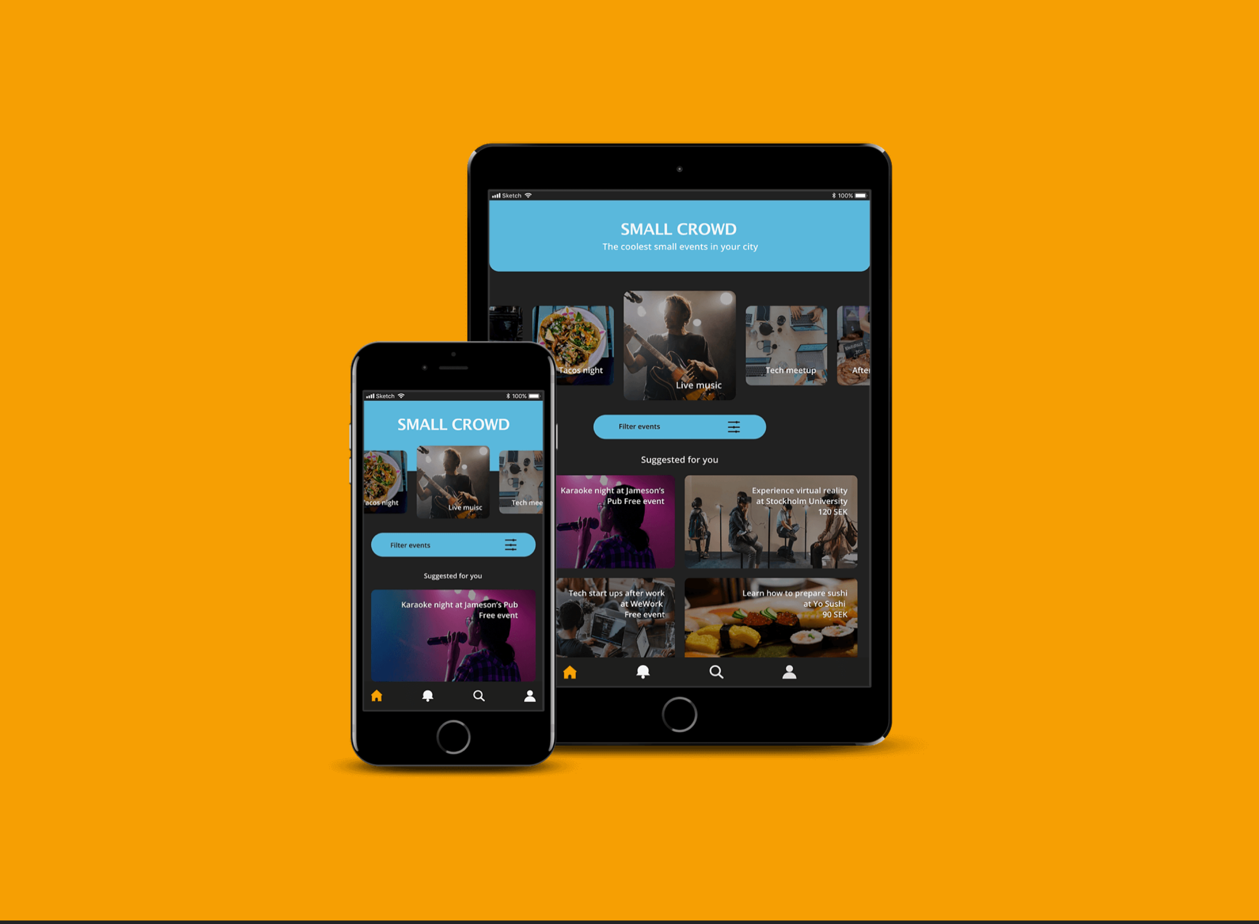
STEP 10. RESPONSIVE DESIGN
UI Design
In final phase of this project, I also created responsive UI design for different devices.